It wasn’t all that long ago that a WordPress site experience was ruled by the clicks of a mouse, but as time moves on, so does technology. Now a user’s experience of a site is highly shaped by the gestures of the swipe, pinch, and spread. Who would’ve thought? It’s easy to use these gestures everyday without thinking too much about it, so let’s take a quick look at what some of them are.
The Common Gestures
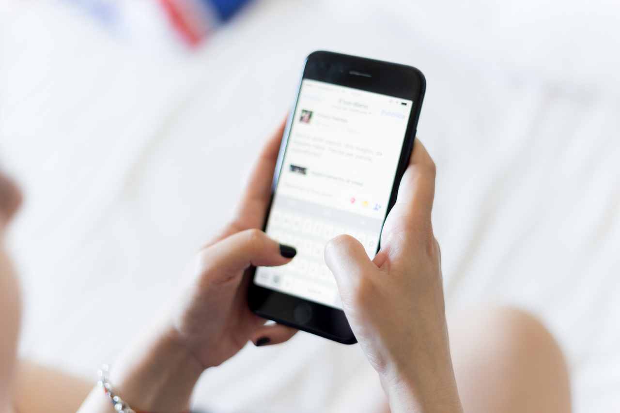
The Tap
The most widely used, this is a single press of one finger on the screen to initiate an action, such as opening an application or pressing on a button.
Double Tap
This is a back to back action of the press of a single finger. This is usually used to cause items to appear bigger on the screen.
Swipe
Swiping is the action of pressing down one’s finger, moving across the screen, and then lifting the finger again. The most common example of this is the unlock feature on an iPhone.
Drag
Dragging is similar to swiping, except at a slower speed. A common example is moving app icons around on a mobile phone.
Pinch
The pinch is a press of two fingers at the same time, moving them away from each other, and then lifting them up. This action is usually used for zooming in on something, such as a photo.
Why Do Gestures Matter?
New technologies can suffer from “Default Thinking“. Described by Scott Jenson, “the problem is simple, but pernicious: designers think of new technologies in terms of yesterday’s tasks, failing to clearly see the real potential of the new technologies”.
According to the current screen resolution stats of 2019, the majority of users worldwide are engaging via mobile. Therefore it becomes incredibly important to keep mobile’s associated expectations of gestures in mind when designing a site. They’re a part of the package, whether you like it or not. (This all comes with the caveat that these statistics are generalized and what matters above all else is the screen your particular audience is using. Because that answer may not be mobile.)
How Does this Impact Design?
A finger tip is much larger than a mouse cursor, and moves quite differently. This inevitably adds a new layer to keep in mind when designing for mobile. A big aspect of this is button size. Too small of a button and the user could be led to the wrong place, become frustrated, and leave your site quickly.
Another key user experience concern is the areas of the screen that a finger or thumb can comfortably reach. At what point are they stretching? Where can they navigate without the risk of dropping their phone? For some more mobile design specifics, take a look at the blog post Designing for a Mobile Environment.
While it can feel overwhelming to take this all into account, there is a lot that’s exciting about it. Gestures feel more natural than clicking around a cursor, and therefore create a more natural experience for the user. This in turn makes it more inviting to engage with your site longer.
There’s also a real opportunity for decluttering. A mobile screen is smaller than a desktop and fingers are bigger than a cursor. This puts a real push towards clean, user friendly design. Which will inevitably result in more seamless interactions and a more satisfied end user.
In Conclusion
With the ever increasing importance of mobile design, keeping gesture driven user experiences at the forefront of your site’s design can only be a positive. However, we’re not done with the desktop quite yet, so add it to your site’s list of needs, but not at the exclusion of a clean desktop design.