With the rise of smartphones, mobile devices account for 15% of all internet traffic. There are many ways to go online, like desktops, smartphones, laptops, and iPads. All of these devices have different screen sizes, which need to be considered when designing a website. World Wide Web Consortium (W3C) standards conformity is the #1 consideration in creating content that persists across multiple devices, and we design all of our sites to meet this universally accepted standard. In addition, we use a technique known as responsive web design, in order to manage how content looks on all screen sizes.
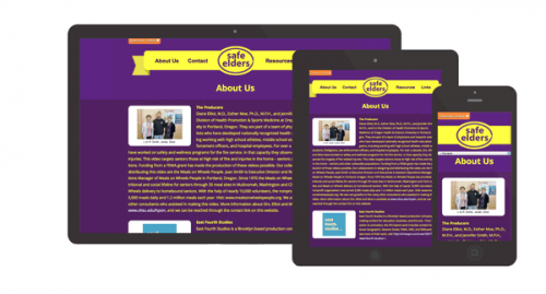
Responsive web design is when the website content “responds” to the size of the visitor’s browser, and arranges to fit on the screen. This allows for a website to fit well on a large desktop computer screen, and also fit efficiently within the much smaller screen of a smartphone. Contents, like images and columns of text, change to fit the screen instead of distorting or cutting out of the website design. To learn more, read our guide on Website Redesign.
The benefit of responsive web design is to simplify the user experience. On mobile devices, there is no pinching and zooming because the content is already fitting on the screen in a legible size. The internet should be easy to navigate, so it is important for our websites to respond to the needs of our visitors.
We are always excited to improve website designs and optimize user experiences. When developing a website, we strongly consider the devices of the audience, and the needs of modern browsers at various screen sizes. More people will be using smartphones and various devices to go online, and it is our pleasure to build aesthetic and smart designs to fit their screens.
More on Website Redesign
- Website Redesign Website Redesign Services for Growing Businesses Professional website redesign services that improve conversion, usability, and…