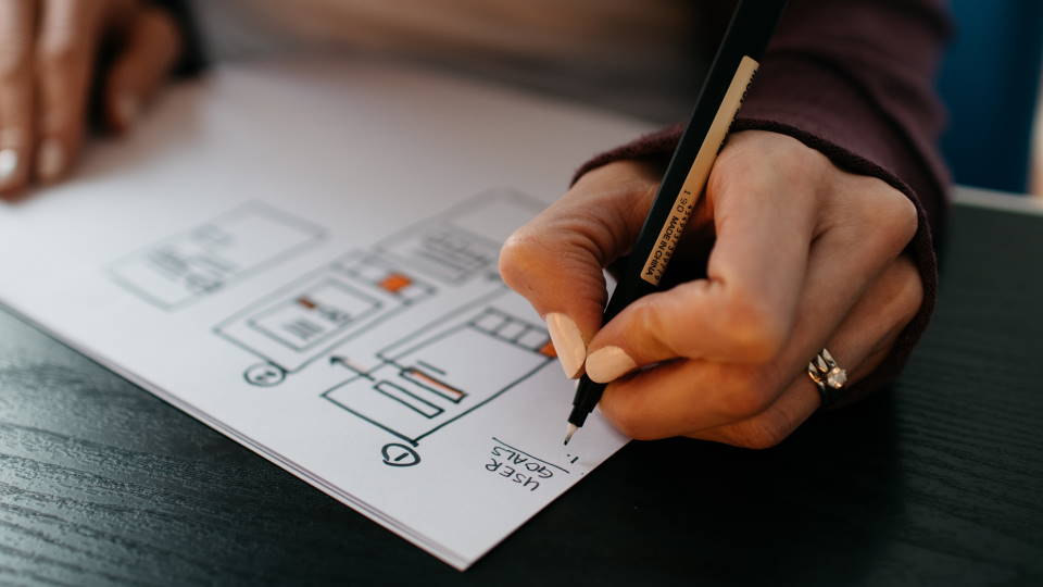
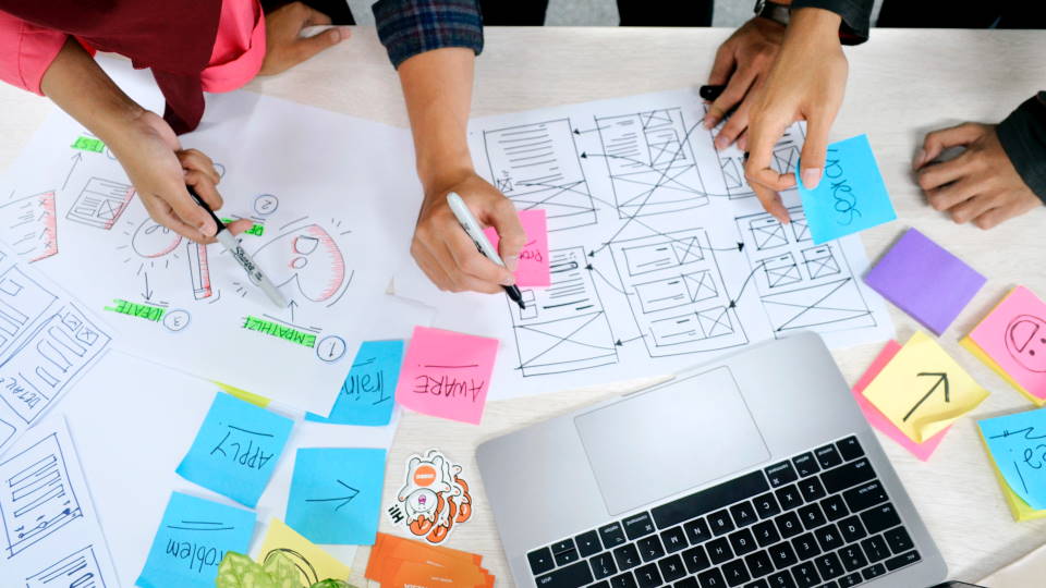
The best website layout is the one that makes it easy for users to accomplish their goals. That means that the best layout design is going to be different for each website.
If you’re not a professional web designer, it can be hard to know what’s going to work best for your particular site. And even when you do make a decision on the layout design, how do you know if it was the right one?
These few steps will help you through the process of designing a layout for your website.
Planning and Inspiration
Before you start working, you need to get some ideas and inspiration. Take a look at other sites that you like, especially your competitors and other sites similar to your own (ie if you run an online store, look at other ecommerce websites that sell similar products). Decide what parts of each site you like and don’t like, and pay careful attention to any design elements or features that all the sites have in common.
After looking at a few sites, you should be able to take the best parts of each and work them into your own design. If there’s any one thing that all the sites seem to do the same, pay attention to it. It might be a color scheme, or the particular placement of a button or form. If there’s one thing that every site in your industry is doing the same, it might be an industry standard that your customers come to expect.
Conventions and Industry Standards
While every site is unique, there are a few different website archetypes that most internet users are familiar with. Blogs and news websites post a lot of new content, and their homepage is usually a collection of the latest articles posted on the site. Ecommerce sites and online shops want to sell products, and a layout that makes it easy for users to search and find the right stuff is important. Business websites aim to turn visitors into clients and customers, and need a design that streamlines the process for generating leads.
It’s important to set your website apart, but don’t do that at the expense of the user experience or your website’s bottom line. Users have expectations about how to use different types of websites, and straying too far from the norm can leave them confused.
When your users intuitively understand how to navigate your website, you have a better chance of them staying longer and coming back.
Less Is More
Don’t try and cram too much into a small space on the page. Your visitors will only be able to process a few things at a time.
Try and build your layout in sections, where a few design elements work together to encourage the user to act. Maybe that’s an image accompanied by some descriptive text and a link to a page with more details. It could also be a feed of the latest posts on the site, encouraging the user to click and read further.
Don’t be afraid to add empty space and use margins to separate different sections of your layout. Breaking things up will let your visitors process each section in order and make a decision. Jumbling everything together will only make them confused and frustrated.

Work Backwards From The Conversion
Just like different websites have different layout conventions, they also have different goals for their users. When deciding on a layout for your site, you should have that end goal in mind. Whether you want to increase product sales or get more contact form submissions, start from the goal and work backwards.
For example, if you find that you’re not receiving very many form submissions, try moving your contact form further up the page, and using design elements and compelling text copy to make it more noticeable.
Trying to hit the goal immediately isn’t always the best approach; sometimes you need to build up trust and confidence in new visitors before they take that step. In that case, you could focus on including more text on the page, detailing the benefits of your product or service and establishing credibility before including your form at the bottom.
When you know what you want your visitors to do, you can get a better idea of how to structure your site to guide them in that direction.
Consistent Branding And Color
Text content isn’t the only way to build trust and credibility with new visitors. Having a consistent, cohesive design does just as much to establish the sense of being a “real” website.
Colors play a really important part in web design. Different colors make us feel different ways, and using a specific color scheme across your entire site helps bring the whole thing together. Pick a few base colors and a single accent color, and incorporate those colors throughout your website.
Formatting is another important factor to keep consistent. Having the same fonts, sizes, and spacing will make all of the pages on your website feel connected. We already know the power that website conventions have over users, but once they come to recognize the conventions of your specific website, they will see you as an authority on your subject matter.
Use Images Deliberately
Images are important, and the internet is only getting more visual. It’s also really easy to overdo it with images, or for one bad image to ruin an entire design.
Pick a few quality images that add context or feeling to the text on the page. If you decide to use images in a background with text overlaid on top, be sure that the text contrasts enough too stay legible.
Design For Mobile, Desktop, and Tablet
After putting in all this work, it can be tempting to just design your layout for a single screen size and call it finished. However, that’s not how the world works. Some people are going to see your website on a phone or tablet, and some on a laptop or desktop.
To really get the most out of your design, you need to account for all of these different screen sizes. It’s easy to implement a basic responsive design and collapse everything down to one column, but going the extra mile to design layouts for each device is the only way to get the most out of your design.
If you put all this together and take the time to do everything right, you can design a custom website layout that you can feel confident in, even without prior design experience. As you move forward, you can learn about A/B testing and optimization to really understand how to design a better website layout. Along the way, if you’re feeling stuck or could use a little guidance, Watermelon is always here to help!

